Monday 31 March 2014

Project Life | Week Nine...

Hello Project Lifers and Sassy Fans!  How are  you all progressing with your own PL projects?  Do you often find yourself following a similar style each week as you sit down to document? Or do you like to mix things up each week?  I personally like to have a hint of similarity from week to week , just to create cohesion throughout my entire album and I am discovering I have repeat patterns.  Especially when it comes to choosing the papers and embellishments to showcase my stories. This week I am sharing with you my Week Nine | February 24 - March 02.


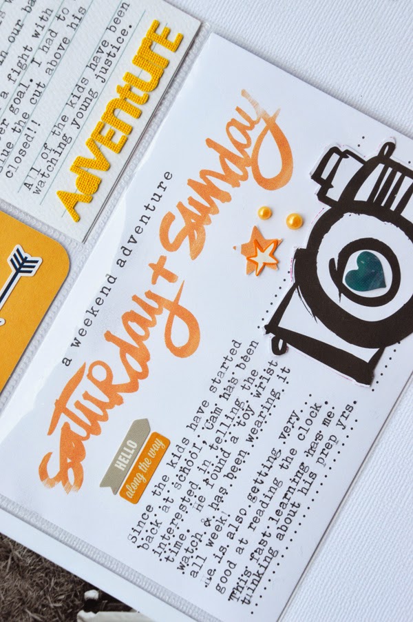
One thing that is constant with my PL pages, is that I take inspiration from my photos.  This one is no different from the others and there is one photo in particular this week, that has sparked my colour run for the entire spread!  I am just thankful that the rest of my photos don't clash too badly! *grin*


This week was a momentous one for my older two boys.  After a few years of waiting for an opportunity to play an extracurricular sport, they finally commenced (and committed to) grass hockey.  It was this photo of the two of them, testing out their mouth guards, that launched my colour inspiration for Week Nine - orange, black and a touch of blue.


As I looked through the rest of my photos, I noticed that they weren't that dissimilar in the colour range.  Nothing that a strategically placed, typed quote couldn't fix!


And since the colour orange is often associated with the season Autumn, aren't I lucky I could take note of it during Week Nine!


As an extra bonus for my colour choice this week, I found a clothing tag that totally depicts the superhero craze my children are embracing.  I simply trimmed the edges to fit the 3x4" pocket and backed it with a piece of Carta Bella patterned paper.


And it also helps that my youngest drew stripes on his face in orange pen!  Everything this week was working in my favour to use orange as my base colour! LOL!

 
To balance the "orange" overload, I've added touches of blue.  Where orange is on the warmer spectrum of the colour wheel, blue is definitely on the cooler side.  The blue counteracts the boldness of the orange, in a subtle manner, allowing the eye to rest.  In other words, you really shouldn't need to reach for your sunglasses!! *grin*


So, if you are struggling to decide on a clear direction for your PL spread, always feel free to take inspiration from your photos.  A colour scheme sparked by one photo can inspire the entire spread and create surprising results.  Thanks for visiting..x
 
 Amy Tangerine Plus One Combo Paper 12x12 Amy Tangerine Plus One Pair Paper 12x12 Amy Tangerine Plus One Copilot Paper 12x12
Amy Tangerine Accent and Phrase Stickers Amy Tangerine Plus One Puffy Stickers Lemon Lush Vellum Labels Woodland Park Sticky Keys Peacock BlueJillibean Soup Little Things Soup Labels
 
Sentiments V.1 Typecast Alpha Stickers Black Neon Flair Buttons Printshop Black Doodle Alphas Hello Again Journalling Cards
 
 
Photobucket

Friday 28 March 2014

Today We Play

Hello Sassy Friends and happy Friday to you all!
 
It's the last few days to hop in and join us for our fabulous March Moodboard! 
Your gorgeous entry could land you a tasty voucher to spend 
on whatever your little heart desires!

Keeping it sweet and simple today with this layout using Glitz Design 'Hello Friend' along 
with some Heidi Swapp, Pink Paislee and Evalicious goodies.
 Echoing the pretty printed banners on the patterned paper 
with this HS acrylic banner, machine stitched on.
 I've highlighted the circular print with lots of mixed circular embellies, like sequins,
enamel dots and a epoxy sticker I made with my Epiphany round tool.
 I've always had a huge crush on the Glitz Giant Rhinestones. This clear one from the Finnley collection was perfect for this project. The new Evalicious embellishments 
are quite fabulous also! I was very impressed that the flair badges came pre-loaded
with adhesive as well as being placed on individually perforated clear backings to make testing them out on your page super easy.

In other news, I had the wonderful chance to catch up with the enchanting Heidi Swapp yesterday. So great to see her again and be completely inspired by the new lines about to hit the Sassy shelves imminently!! Dreamy, My Favorite Things and new Color Magic lines are available to pre-order already, so avoid disappointment and grab yours now!
 
Wishing you a wonderful weekend!
 
Chantalle


Thursday 27 March 2014

G'day Mate - Carta Bella

Hi everyone
Anita here sharing more carta bella hello again 
This week I was inspired by this photo I took of a kookaburra in our garden

i love how using patterned paper behind white cardstock can give you a framed look and helps soften or brighten the layout
i used the punched hearts like confetti with the sequins and watercolour droplets

i added a few bits of chipboard from ScrapFX  and painted them with watercolour and clear embossed them

i made more leaves


i hope i have inspired you this month using Carta bella
check out the carta bella range in the sassy store


Happy Crafting

Photobucket
09 10